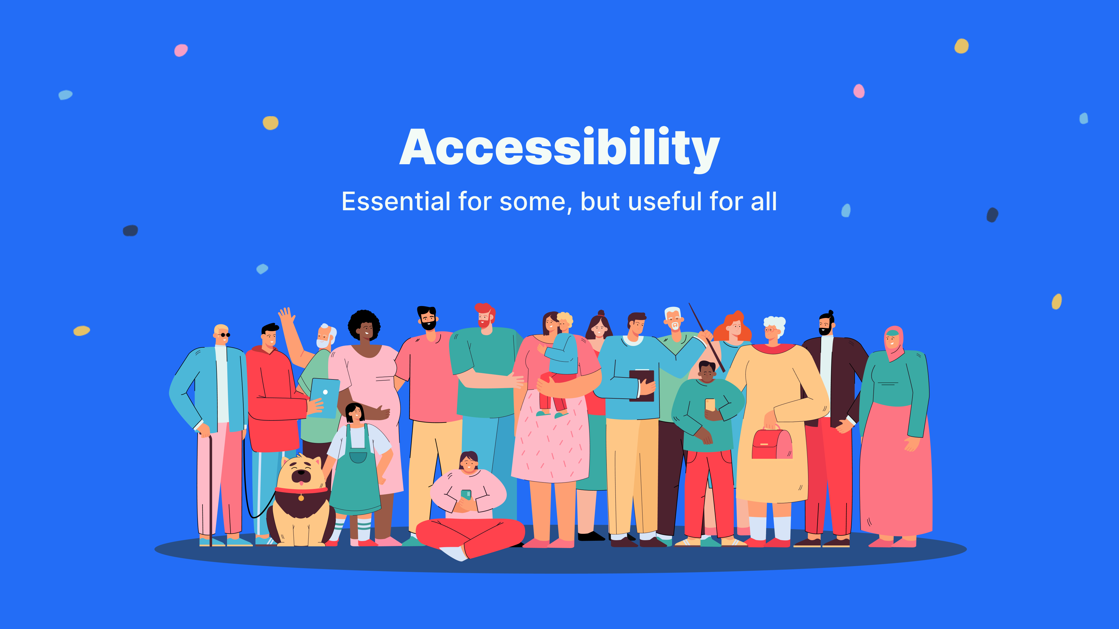
Designing Accessible Digital Experiences
How I helped Cohesity’s Design team learn, educate, and integrate accessibility into their work habits and user experience designs
Discover the Accessibility Gap
After several years of designing and delivering a world-class, expanding data management platform to leading companies across industries like health, financial, insurance, federal, education, and more, we realized we had an important and specific challenge to prioritize: to ensure that our software allows people with the widest possible variety of capabilities to navigate, deploy, and benefit from the full spectrum of features and solutions our platform offers.
For the Cohesity Design team, addressing accessibility is driven by two priorities:
- Inclusivity. We knew we’d have to learn about and try to understand more deeply the particular challenges that users with vision, hearing, motor, and cognitive disabilities encounter and the tools they use to navigate software. What’s more, we understood that by improving the accessibility of our software, we could improve the experience for all our users.
- Business. A growing number of enterprise customers in the financial, health, and federal sectors, among others, have also come to recognize the importance of accessibility and are requiring certifications like VPATs (Voluntary Product Accessibility Templates) to ensure WCAG (Web Content Accessibility Guidelines) compliance as they evaluate their purchase options. Ensuring compliance with accessibility standards not only helps sales, it can also help companies avoid potential lawsuits.
Before this moment, Cohesity had been hiring external contractors to perform audits and write VPATs. As soon as we took a closer look ourselves, we realized we had major accessibility oversights in our product development. Unwittingly, we had created barriers for users with disabilities. This was unacceptable, and we decided to fix it ourselves, in house.
Define Accessibility Mission
In September 2020, our head of Design gave us a mandate:
Make accessibility a core Design team competence.
We needed to bring accessibility design and testing in house and to be able to do that, we defined four high-level practical project goals:
- Understand. We couldn’t start without first understanding all the accessibility standards that our software needs to support.
- Educate. The core accessibility team then needs to educate other designers and developers on what will be required from them to support accessibility.
- Integrate with Design. With the team up to speed, the next step would be to review and update our UI design system for accessibility — the visual elements, the color palettes, text styles, and more — in both light and dark themes. Accessibility needs to become an integral part of every design, every workflow, every review, and every implementation.
- Automate Testing. Finally, we will need to integrate accessibility into every aspect of our design library and evaluate tools that can automate accessibility testing, and work with lead UI engineers to integrate and automate accessibility testing in the product development lifecycle.
Attack the Accessibility Gap
Understand
Before we could take any initiative, we realized we needed to educate ourselves first, analyze our product for specific accessibility issues across the UI, and then compile the results and the lessons to share with the rest of the team. So we set out on our journey:
- Plan. We began by creating a plan (in Asana, a project-management tool), and listing all the different tasks we would need to accomplish, from analysis to standards and the tools to achieve them, from understanding new principles to applying them to our designs, and from changing our approach to working with other teams in the product development lifecycle.
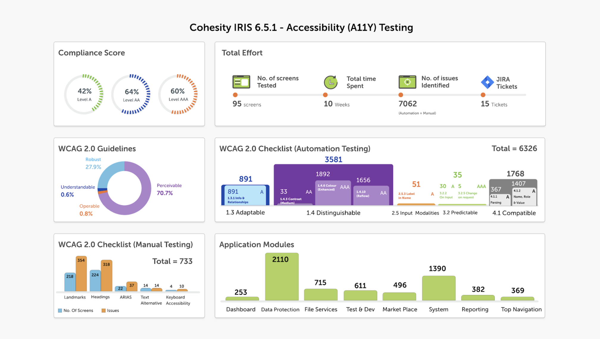
- Report. We then reviewed all the audits conducted by the external contractors and recorded the gamut of issues related to keyboard navigation, color contrast, labeling, etc., and organized them (in Airtable, a great tool for managing workflow). This made it easy to communicate the scope of work to other stakeholders in the company.
3. Learn. Finally, we studied the guidelines mentioned on the WCAG website. We read several recommended books and took two online courses (from Udacity & Udemy). We also watched a lot of videos and tutorials on Youtube.
Educate
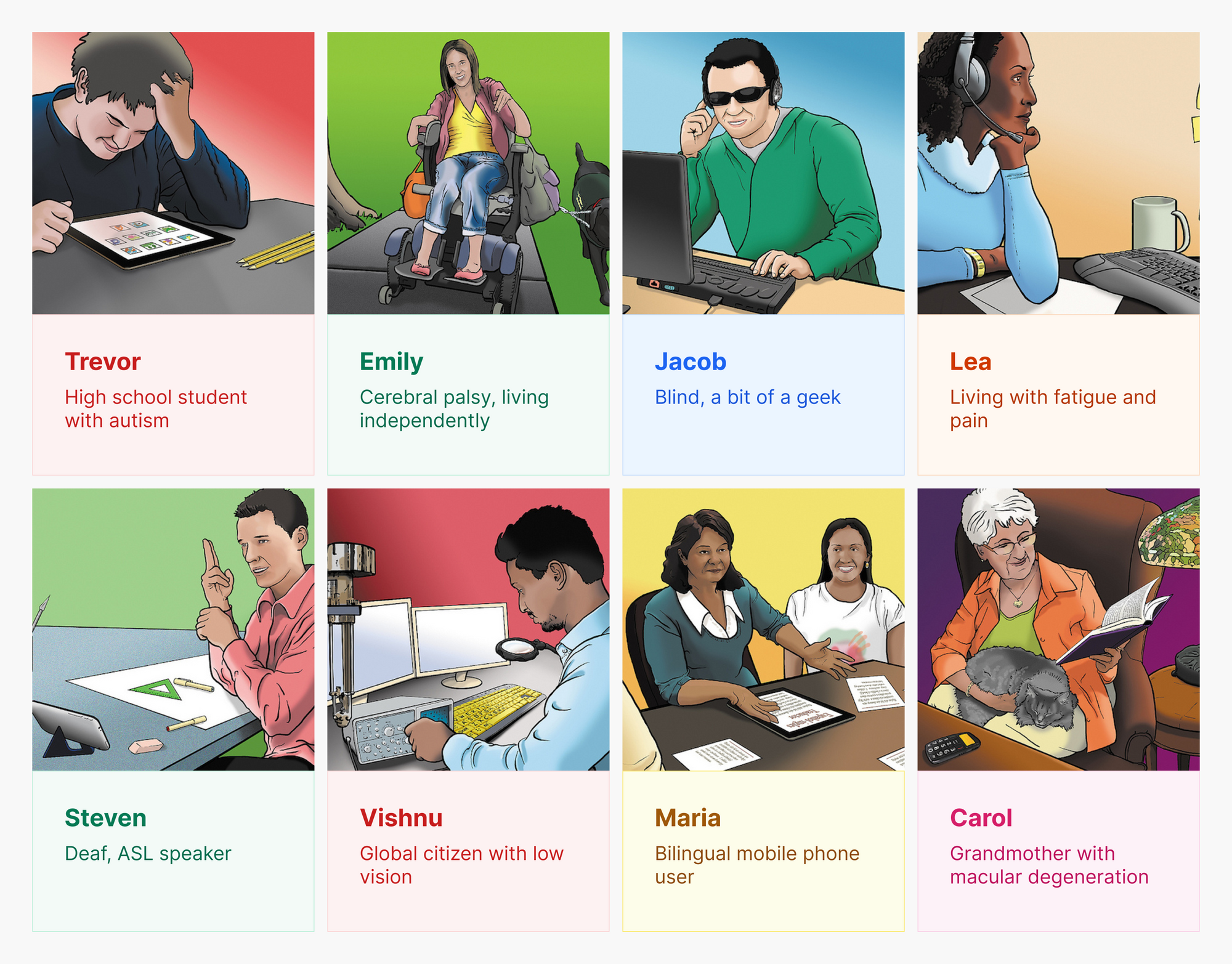
From our research, we distilled the concepts and translated them into presentations, which we then shared with the entire Design team as brown bag sessions. We began by introducing personas, examples of different types of users with different tasks, needs, and challenges.
Once we established a better understanding on the team of just how broad the diversity of users and their particular barriers might be, we organized our presentations into three themes:
- Build Empathy. We walked through different personas and provided examples of the barriers people with different disabilities face and how to avoid them.
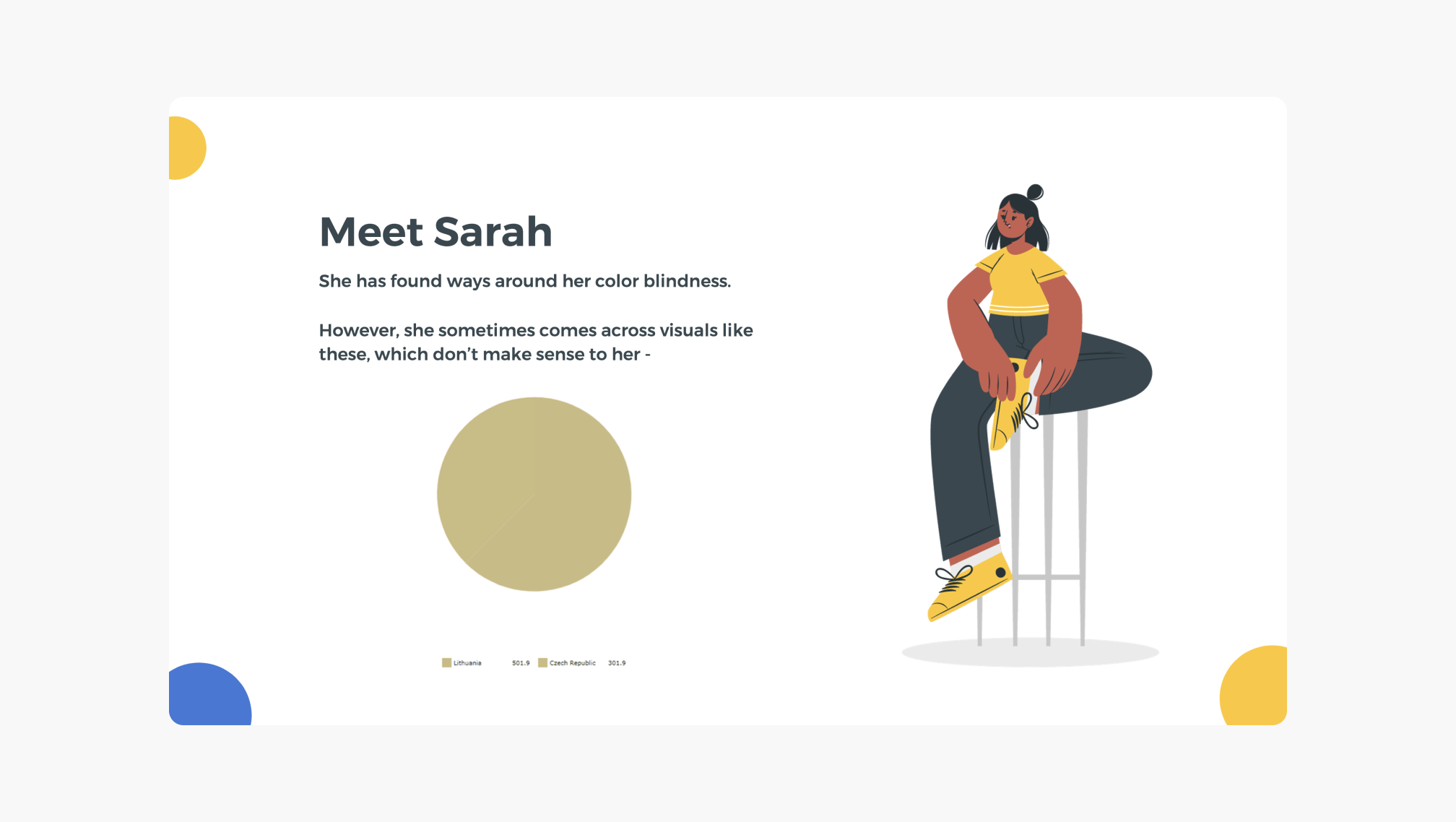
For users like Sarah, who see colors differently, it is important to use charts with colors that they can distinguish easily. When we do so, we also make our charts and other visual elements easier to understand for all users, regardless of vision impairments.
- Review WCAG, Laws, & Guidelines. We presented a detailed overview of the WCAG structure and a glance at different accessibility laws around the world. This helped our team understand the different policies already established on this subject.
- Apply the Principles. In this session, we shared practical examples on how to meet those WCAG guidelines. Just one such example was ensuring text content readability. There are many issues, such as size and lack of contrast, that can make text extremely difficult to read, often for everyone, but especially for users with vision barriers. To fix this, we reviewed the size and color contrast of all the text-based UI components in both light and dark themes in our design system, and updated them where necessary.
In addition to the brown bag sessions, to scale learning, we also had the entire Design team complete a free Web Accessibility course on Udacity, and created additional resources as we learnt more and more and deepened our understanding of accessibility.
Integrate with Design
With shared knowledge across the team, we made efforts to integrate accessibility considerations so that we could strategically fix issues and improve our product development process. We addressed every aspect of our design system, including:
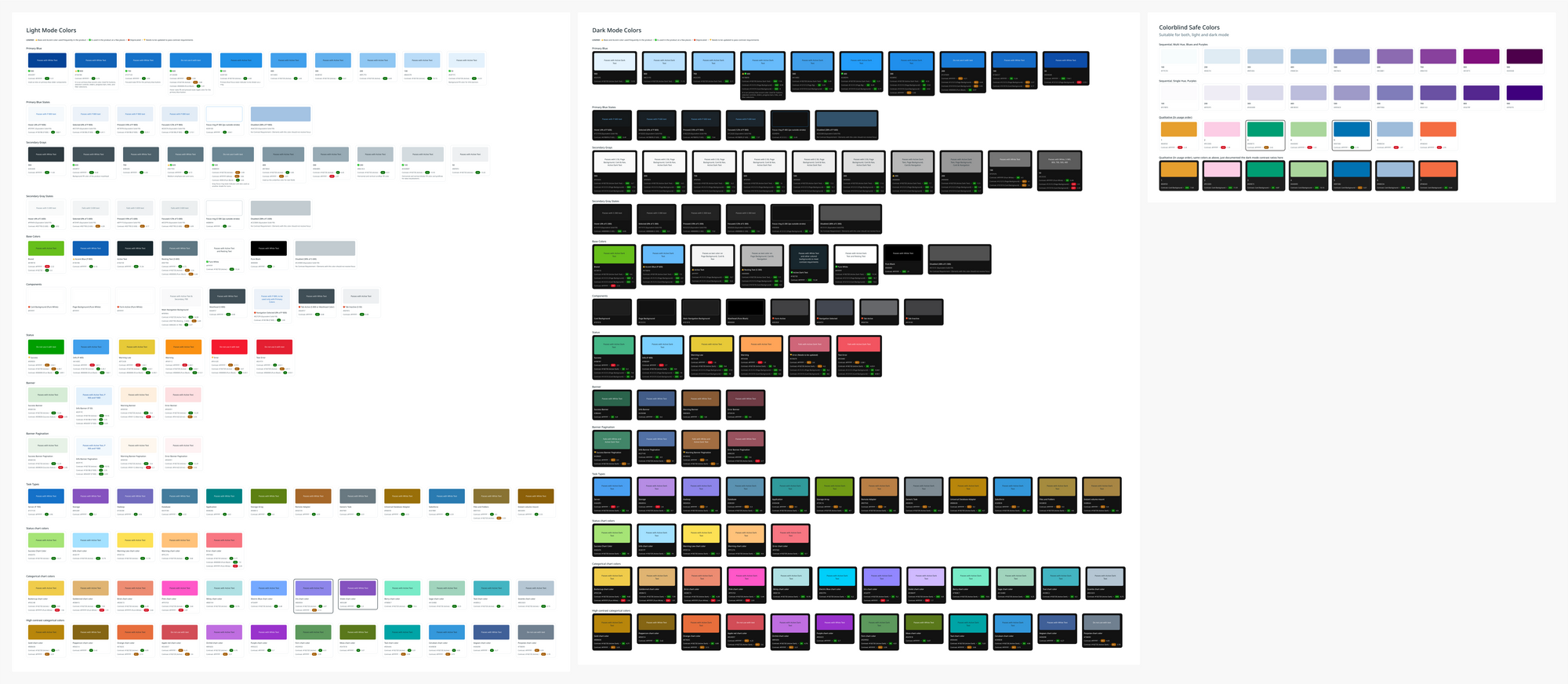
- Colors & Text Styles. We audited our color palettes for both light and dark themes, documented the contrast ratios, identified which combinations did not pass the guidelines, and systematically made adjustments to meet minimum contrast requirements. We also updated our text styles to include sufficient line height and hierarchy among our different font sizes.
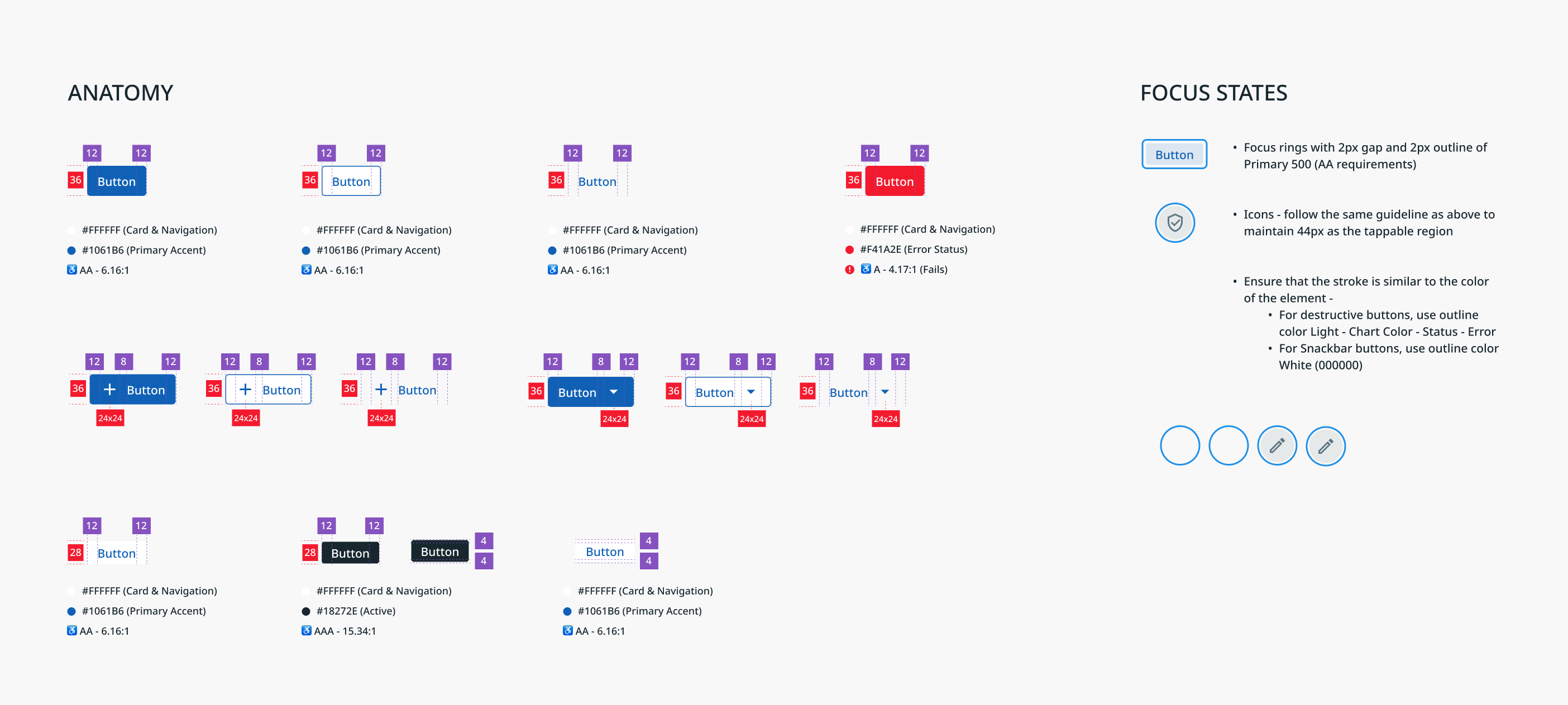
- Specs. We measured our design components (buttons, menus, inputs, icons, etc.) to ensure that spacing, padding, target size, and focus states not only meet guidelines, but also align with development.
- Docs. The Design team then began creating detailed documentation of the design system along with the accessibility requirements for each component.
Automate Testing
In addition to design, it is crucial to avoid treating accessibility as an afterthought in the UI development process itself. It was important to work with the UI developers to address accessibility as part of their everyday work and to automate accessibility testing. To do this, we addressed two areas:
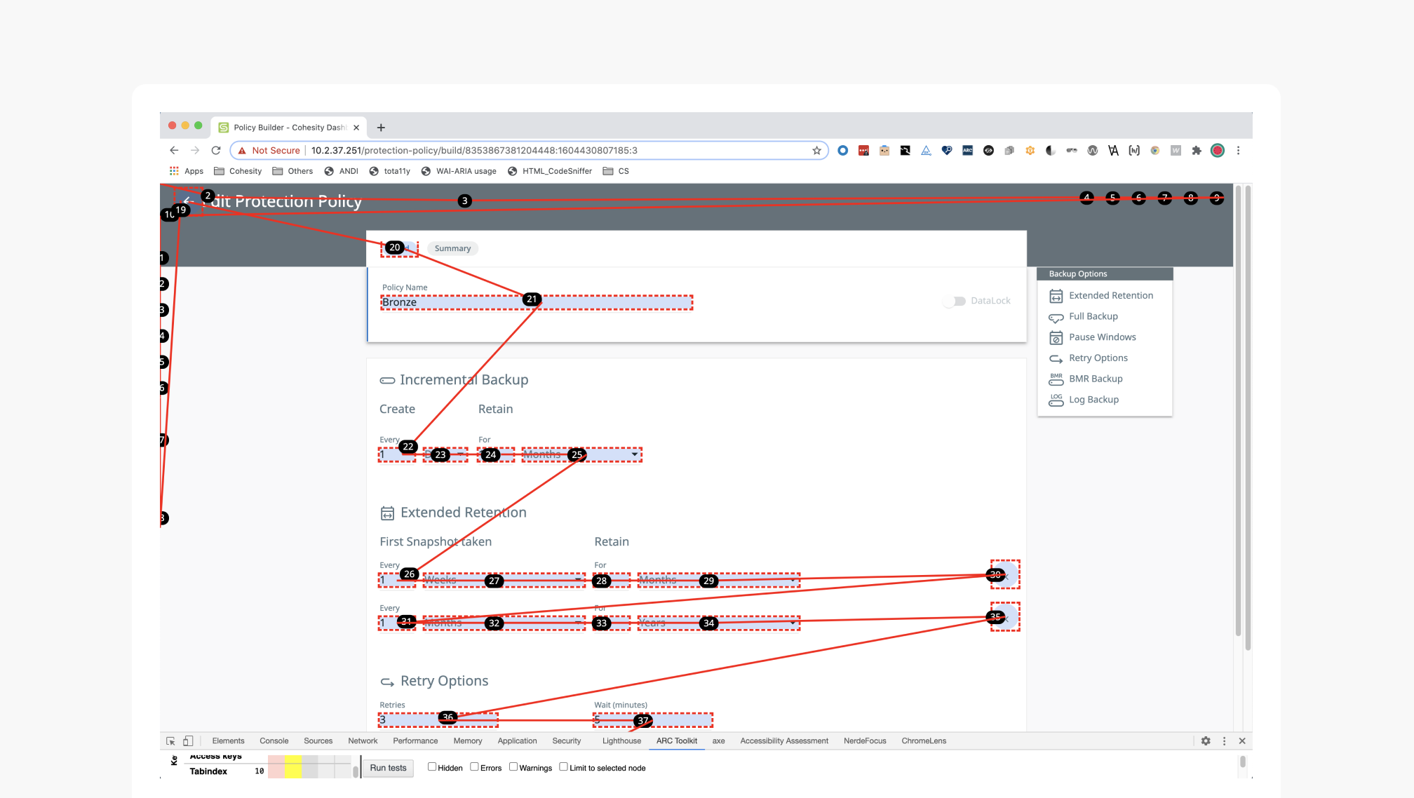
- Code. To automate accessibility testing during the development process, we integrated AXE by Deque with our Cypress unit testing framework so that engineers are made aware of accessibility violations as they write the code.
Note, however, that less than 25% of accessibility checks can be resolved by automation testing; a large amount still requires manual audit. Similarly, it is possible to make your product technically accessible but not usable. For that reason, you should always also include direct usability testing; testing your product with real users with disabilities helps uncover major insights which cannot be covered by automation. - Report. We added the results of the Cypress unit tests to our Airtable data, so that we can create reports to show the trend of issues identified and fixed over time. Also, to keep the team accountable we maintained a Weekly Accessibility Updates slide deck where we documented the progress we made each week.
Our Impact — How’d we do?
- Firstly, we presented our work to the leadership team and got executive buy-in to increase funding so that we can hire accessibility-focused engineers and also improve internal training. We also hired a seasoned accessibility lead in the Design team to take accessibility efforts forward.
- Secondly, we educated the entire team on this subject and now we write our own VPATs — no need to hire external contractors any more.
- Thirdly, we made accessibility a core Design team competence. It got listed in our company OKRs (objectives and key results) and we achieved 100% of our plan.
Design for Accessibility, Improve for Everyone
At this juncture in our accessibility journey, having integrated accessibility into our everyday design thinking and into the product development process itself, from original design to UI deployment, you might ask: What do we at Cohesity Design do differently now? That’s a question we love to answer, because every member on our team now feels a responsibility to keep these essential guidelines in mind as we continue to expand and improve our users’ experience in the Cohesity platform:
- Keep the design structures understandable and easy to follow.
- Maintain clean layouts with clear headings and visual hierarchy.
- Avoid using color alone to communicate information to the user.
- When you use color, ensure you have sufficient contrast to support several different color vision deficiencies.
- Ensure you have specified and documented all design component states (resting, active, hover, disabled, clicked, etc.).
- Ensure you support screen readers and have documented that support.
- Communicate keyboard tab order to engineers.
- Review final designs with a dedicated accessibility lead and work with developers to audit, file, and address accessibility issues.
But our journey is never over. In the coming months, we’ll be taking on new challenges in accessibility, including incorporating localization critique early in the process, to avoid common mistakes that crop up in translation (such as links embedded in on-screen text that might appear very differently in other languages).
As we deepen our understanding of designing with accessibility, we wonder: What surprising discoveries and changes will your accessibility journey produce for you?
Credits
- Bart Abicht (UX Writer)
- Saloni Dhawan (Product Designer)
FIN.